Where do meaning comes from?

Every now and then, I’ll always come back to this blog to throw out some ideas. I’ve been doing a lots of reading, sometimes I understand what I read and other times it all seems vague to me. Of course no doubt they’re all interesting to read, regardless whether I could understand or not what the author tried to say. There’s few particularly who caught my attention. Stuart Hall, on cultural representation and meaning, is one of the very interesting readings at this time for me. The theories of representation and approaches explaining “how representation of meaning through language works” interest me very much. Questions like “Where do meaning comes from?” and “How can we tell the ‘true’ meaning of word and image?” take my thought away for a while.

The interesting parts of this is not so much about the object. It’s about the meaning and the representation of the meaning itself. Did you ever go out of your own ‘world’?. Our meaning of world are very subjective, depending on where we come from, experiences we have, and education we get. My meaning and understanding of world is so much different now than ten years ago. I spent 27 years in Malaysia and half of my age in Penang. That’s my world. People, culture, languages, food, religions and the way of life are part of my world. I’m not saying that we are not connected to other world. We watch TV’s, listen to radio, we have overseas magazines and books, we watch movies at the cinema, etc. All this doesn’t really give much meaning to me. It’s stereotyping my meaning of other world if I could say that. I would look at others that are not part of my world as western world.

Until I travelled far, far out of my ‘world’ and tried to get to the other world then this particular meaning of other ‘stereotype world’, in my contexts is the western world started to change. Meaning comes with the experiences and understanding of the cultural practices behind it. It’s not only what you see visually but also the meaning behind it. I saw and read many overseas materials when I was in Malaysia. I imagined many different situations with it. But imagination is unlimited. It has led me to a dreamland. Until I feel, experience and taste it myself then it will become reality. Then the meaning changes. Perceptions and information exchange. How far can meaning and perceptions go with certain information? To what extend until it stops and gives another meanings? My meanings of the western world have changed through my feel, look, experiences and way of life.

Deconstruction extended..

It’s really interesting to look back a the history of Graphic design in Deconstruction. Sadly in my undergraduate, we did not covers any of this areas, yet we covers most of History of Fine Arts. Perhaps most of our lectures at that time are from the Fine Arts education background. I wonder, if we learn the history of Graphic Design as part of our curriculum in our undergraduates, will it change our design practices and thinking on Graphic design back in Malaysia? Hmmm…

Continuing on my process of understanding about deconstruction I came to understand that Jacques Derrida’s (a French philosopher) theories seems to be the backbones of the deconstruction process in design and architecture. ‘There’s nothing outside of the text’ (Derrida). He suggest the way the language depends on the play of differences between one word and another, while meaning itself is always deferred. The purpose of such devices was to prevent conceptual closure, or reduction of his texts to an ultimate meaning. All these ideas can be seen at work in post-modern Graphic Design and Derridean concepts such as ‘sous rature’ – the tactic of putting an idea under erasure’ by crossing it out, in order to alert the reader not to accept it at face value – have found their ways to into graphic practices. (Poynor 47:2002)

Here are some designers and authors ideas on deconstruction.

This is how deconstruction arrived in graphic Design. It started through Architecture – during MoMa ( Museum of Modern Arts) which was held an exhibition in 1988 and its catalog that probably did the most to introduce deconstruction to Graphic Designers. The exhibition curated by Philip Johnson with the assistance of Mark Wigley. What distinguished and linked their work argued Wigley, was a sensibility in which ‘the dream of pure form has been disturbed. Form has become contaminated’. Deconstructive architecture he explained does not dismantle buildings, rather it locates the inherent dilemmas within them, exposing the ‘symptoms of a impurity’. (Johnson & Wigley 10:1988)

The process of deconstructions in Graphic Design evolved in late 80’s to late 90’s. There are few discourses about the interpretations of the action taken of deconstruction in Graphic Design practices. Design Historian – Philip Meggs in ‘Deconstructing Typography’ 1990, defines deconstruction as ‘taking the integrated whole apart, or destroying the underlying order that holds a graphic design together. In the same year two graphic designers, Chuck Bryne and Martha Witte, published their definition on deconstruction in design on more critically aware sense of deconstuction’s root in theory. For Bryne and Witte the word refers to the breaking down something in order to ‘decode’ its parts in such a way that these act as ‘informers’ on the thing, or any assumptions or convictions we have regarding it. Their emphasis on deconstruction is simply taking things apart in the hope to make form and giving a new look in print media.

From my readings, I found that there’s two school of practices on deconstruction of Graphic Design, Cranbrook Academy of Art and California Institute of Arts (CalArt). Mc Coys (Katherine and Michael) describe the uses of theory at th academy as
“The emerging ideas emphasized the construction of meaning between the audience and the graphic design piece, a visual transaction that parallels verbal communication. Building on the linguistic theories of semantics but rejecting the faith in scientifically predictable transmission of meaning, these ideas began to have an impact on the students’ graphic work. (Cranbrook Arts Students’ Work, 1978)”

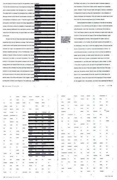
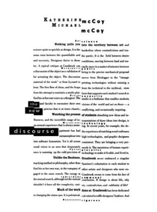
In a poster for Cranbrook graduate programme 1989, Katherine Mc Coy had used a series of Derridean oppositions theory – art/science, mythology/technology, purist/pruralist, vernacular/classic to structure the opposition around the spine.

picture-4.png

.picture-3.png

picture-1.png
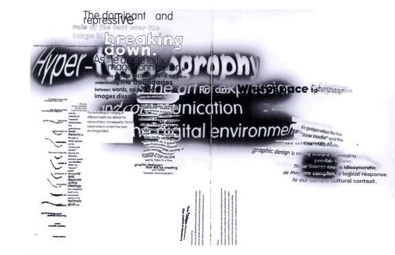
Jeffery Keedy – Fast Forward book spread, California Institutes of Arts, USA (1993)

‘We want to talk about graphic through our own medium – to articulate our own reflections graphically. Not as cultural theoreticians who have no clue about Font. ‘ – Manuel Krebs

picture-2.png
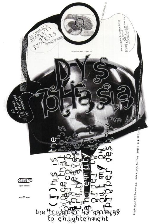
Elliott Earls – Typeface Family Poster (1995)

Process of understanding deconstruction.

I haven’t been writing for sometime in this blog. I’ve been busy gathering information about DECONSTRUCTION in Graphic Design for my research. The intention to look deeper in this area rise after my presentation in the group meeting. I thought why not, after I didn’t have enough knowledge about this.

Part of the proposal from the group to help in my research, is to look at my collections of advertisement and make a visual analysis out of it. Before I even go near deconstruction I was asking myself, what is visual analysis? So I read and read and read… I came around names like Ellen Lupton, Ric Poynor, some really interesting essay on reproductions of the productions by Althusser (recommended by Neal, thanks), the punk era, Reid the sex pistol graphic designer and more..I could go on. I have to admit I did enjoy digging in this areas under the umbrella of deconstruction. Now the visual analysis…where do I start?

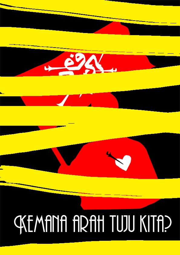
Well, I thought after getting all sort of information from reading and visual inspired of deconstruction I should reconstruct something. I started with one of the add I have. I started with what I understand with the idea of deconstruction, which is to pull out different elements from the constructed adds and reconstruct it with my critical ideas. In other words is the action of putting theoretical text verbose and sought ways to simplify these ideas into graphic form. (Paynor, R. in No More Rules on deconstruction). In 1960’s, designers and artists used and scissored headlines from establishment newspapers and put an attempted to ‘detourne’ the media – to ‘turn it back on itself’ by applying its communications in new contexts.

As for the posters I created based of the Celcom add August 2007, and I have to admit it does have political response in it. Celcom add from my point of view contained an ethnic issues. The guy holding the flag seem Indian or Malay-Indian to me, of course for other people outside of Malaysia will argue the race of that person. Political issues – The questions are what’s the add is telling us and why chose a specific race as a leading person? In the background of the add there’s the youth..little children running following the leading, this contain an issues of nation building, are we creating an image of Malaysia for our future generation?

This work is licensed under a
Creative Commons Attribution-NonCommercial-NoDerivs 2.5 License.

celcom_ad_nst_31aug07small.jpg

umno_keris-bm.jpg
Where are we heading?

This work is licensed under a
Creative Commons Attribution-NonCommercial-NoDerivs 2.5 License.