
It has been a while since I posted something in my blog. Long long while. The reason being is the workloads have taken most of my time. And I have to admit besides that I posted most of my ‘current status’ in a very brief way in the leading social media, the Face Book. Sad but true, this is what’s happening to most of us today. We don’t tend to write long sentences anymore instead we think of a way to post short and brief to express out ‘status’ of the day. Details seems to be forgotten especially if you are actively involved in Twitter. Anyway, I have decided to continue posting and writing in my blog from now on. This hopefully will aid my poor writing skills as I have not been writing as much as I should or to express my thoughts in details these days. I have been asked to conduct a basic InDesign class for fellow designers who have not been familiar working with InDesign, but still dealing with publications and printing (How is that possible?) The 1st one day workshop session start on the 18 October (which I focus more on the training of mind thinking rather than straight into the technical process using InDesign), and on the 2nd day workshop, they have to present their ‘homework’ that I asked them to work on in the 1st session.
So, today I have completed the 2 days sessions of the basic InDesign class teaching designers how to use InDesign for their design work. Yes, surprisingly not many designers now a days knows how to use InDesign software for their book or any publication design. The workshop started with a hands on concept sketching and taking the designers to a very basic understanding of the process of designing for publication, giving some important basic guideline of publication design that they need to know before they even start working with the InDesign softwares.
One of the most important one among other things is the manual part, on how to adjust some parts of the text manually. One of them is kerning. I thought it would be great to keep it in the record for my blog. Here is to show different type of kerning.
https://helpx.adobe.com/indesign/how-to/adjust-letter-spacing.html
To understand kerning here is a useful text that I have extracted from Ellen Lupton Thinking with Type page. You can read more in the page for details.
Kerning is an adjustment of the space between two letters. The characters of the Latin alphabet emerged over time; they were never designed with mechanical or automated spacing in mind. Thus some letter combinations look awkward without special spacing considerations. Gaps occur, for example, around letters whose forms angle outward or frame an open space (W, Y, V, T). In metal type, a kerned letter extends past the lead slug that supports it, allowing two letters to fit more closely together. In digital fonts, the space between letter pairs is controlled by a kerning table created by the type designer, which specifies spaces between problematic letter combinations. Working in a page layout program, a designer can choose to use metric kerning or optical kerning as well as adjusting the space between letters manually where desired. A well-designed typeface requires little or no additional kerning, especially at text sizes.

Metric kerning uses the kerning tables that are built into the typeface. When you select metric kerning in your page layout program, you are using the spacing that was intended by the type designer. Metric kerning usually looks good, especially at small sizes. Cheap novelty fonts often have little or no built-in kerning and will need to be optically kerned.
Optical kerning is executed automatically by the page layout program. Rather than using the pairs addressed in the font’s kerning table, optical kerning assesses the shapes of all characters and adjusts the spacing wherever needed. Some graphic designers apply optical kerning to headlines and metric kerning to text. You can make this process efficient and consistent by setting kerning as part of your character styles.

In InDesign software, there are ways to work manually, which many have not discovered or learned. So here I would like to share with you how to adjust your kerning manually.
How to do it?
Manually kern letter pairs
In display type or large headlines, some pairs of letters may need a little extra attention. To kern manually, place your cursor between two letters, and change the Kerning value in the Character panel.
Tip: To kern quickly and visually, place your cursor between any two letters; then press Option (Mac) or Alt (Win) and click the left or right arrow keys on the keyboard.
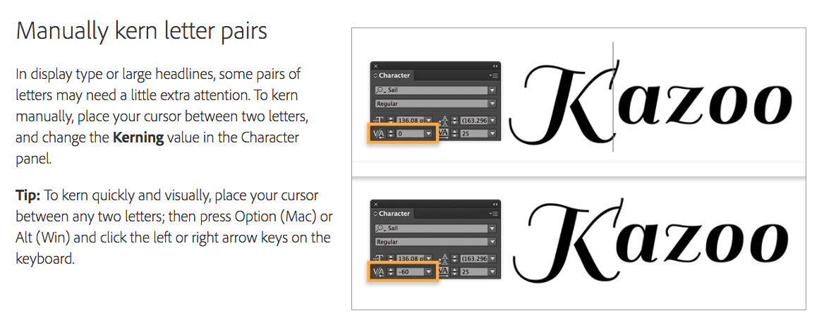
Image taken from InDesign CC tutorial.