
When you start designing in the beginning of 1993, and most of your artwork is in print, and some captured in photography, it has not been digitalise until year 2004, the design lost it’s charm.
When I compare my design to the new designers work, I feel old and the look of my design does look a bit old. But I said to myself, its the same with me, I have years of experience in design, old school practice where I learned and practiced the dark room photography, the prepress printing technique, using offset printing instead of digital printing, the understanding of how to prepare Finished Artwork where most of the new designers won’t even understand when I talk to them about it.
But they have the latest design style, using mostly the wacomm to stylise their design, and I use the real pen and pensil to sketch mine.
After all that thought, i am proud to show my past old school design outcome, most of it are from 1994 till 2000.
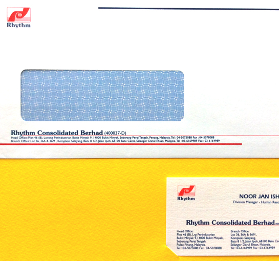
company under Rhythm Consolidated Berhad, I was asked by the HR to redesigned their
name card. I suggested to redesigned the whole corporate identity system (CIS), and they accepted.
This design was created in 1997. I work on it with the HR team, showed it around to the board of Directors, and the staff before finalising the design. I monitored the FA and printing process
with plates (offset printing) till the type of paper chosen. I am so proud of myself when I did this.
It was one of my first real client CIS work that been appreciated by a big company.